

How FARO Technologies Increased Conversion Rates by 1,012% with A/B Testing
Demand Frontier increased conversion on a core business landing page by over 10X, which makes a real business impact.

How we did it:
An conversion data observation led to a UX analysis, which led to a UX redesign - and an A/B test to test our hypothesis.
Streamlined Narrative
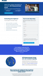
We consolidated product information and were able to eliminate some duplicate information on the page.
Selling the Content
This page is for content marketing. Instead of focussing on the value of the product, we focussed on the value of the content.
Design Aesthetic
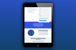
FARO had rebranded, and the old landing page looked like the "old" brand. We gave it a facelift to give audiences confidence in the quality of the content.
Relocated the Form
Landing pages see increased conversion when the form is placed higher on the page.
Social Proof
We added a customer quote. Not about the product, but about the value of the content we're offering. That's our focus.
Added Specificity
While we were able to streamline the overall amount of words on the landing page, we also added more specifics about the value of the content.